How to Choose Paint Colors for Your Home
Choosing paint colors starts with understanding undertones, testing swatches in your actual room light, and building a whole-home palette that flows from room to room. The 60-30-10 rule gives you a reliable framework, and a few timeless palette directions can guide you toward a scheme that feels both personal and enduring.
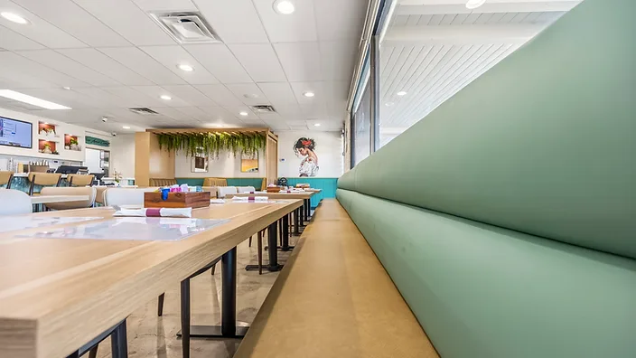
What is the 60-30-10 rule for paint colors?
The 60-30-10 rule is a classic color theory framework that helps you balance three colors in a room. Your dominant color covers 60% of the space (usually walls), your secondary color covers 30% (upholstery, drapery, or an accent wall), and your accent color takes the remaining 10% (pillows, art, or accessories).
This ratio keeps a room from feeling flat or chaotic. When one color dominates, the eye has a clear focal point, and the accent colors feel intentional rather than random.
Warm vs. cool colors: which is right for your room?
Warm colors — reds, oranges, yellows — advance toward you and make a room feel intimate and cozy. Cool colors — blues, greens, violets — recede and make a space feel larger and calmer.
Most rooms benefit from a mix. A warm wall color paired with cool furnishings (or vice versa) creates depth and visual interest. The key is choosing a direction that matches how you want the room to feel, not just what looks good on a chip.
Why paint chips lie (and how to actually test a color)
Paint chips are printed, not painted, and they are viewed under retail lighting — neither of which matches your home. Here is how to test a color properly:
- Buy a sample pot and paint a large swatch — at least 2 feet square — directly on the wall. A tiny chip gives you nothing.
- Test on two walls — one that gets natural light and one that does not. Colors shift dramatically across a room.
- Look at the swatch in morning, midday, and evening light. North-facing rooms stay cool and blue all day; south-facing rooms go warm and golden.
- Place the swatch next to your fixed elements — flooring, countertops, tile, cabinetry — to check undertones.
Undertones are the hidden color beneath the surface. A "neutral gray" might have a blue, green, or purple undertone that only shows up next to your stone countertop. This is the number one reason paint colors look wrong once they are on the wall.
How to build a whole-home palette that flows
A whole-home palette connects your rooms so they feel like one house, not a collection of unrelated spaces. The approach:
- Choose a common neutral — one wall color (or two closely related ones) that runs through hallways, corridors, and connecting spaces.
- Vary saturation, not hue — if your common color is a warm white, let one room go deeper (a warm taupe) and another stay light. The undertone stays consistent, but the mood shifts.
- Use accent colors to differentiate rooms — a bedroom might get a soft blue accent wall, a dining room a muted terracotta. Because the base palette is shared, the accents feel deliberate.
Four timeless palette directions
Warm white and oak. A soft, warm white paired with natural oak tones. Works in nearly any home and never goes out of style.
Sage and stone. Muted sage green walls with warm gray and limestone accents. Grounding, calm, and works beautifully in kitchens and living rooms.
Deep blue and brass. A moody navy or slate blue accent wall with warm brass hardware and lighting. Sophisticated and enduring.
Terracotta and cream. Warm, earthy, and inviting. A muted terracotta accent with cream walls and natural wood tones.
When should you hire a colorist?
If you are painting one room and you are confident in your choice, DIY. But if you are repainting an entire home, working with challenging lighting, or trying to coordinate with existing finishes you cannot change, a color consultant can save you from expensive mistakes. A good colorist charges $200 to $500 for a consultation and can prevent thousands in repainting costs.
If you are planning a larger renovation, we can help you build a cohesive color and materials plan as part of the design process — see our Orange County interior design services for details.
Key takeaways
- Test colors in your actual room, not against a store chip.
- The 60-30-10 rule gives you a reliable balance every time.
- Undertones matter more than the color name on the can.
- A shared base palette makes a whole home feel intentional.
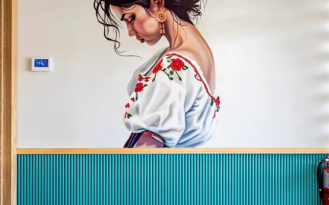

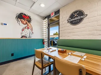
See how we applied these principles in our Bandoleros Cafe project.
For more design fundamentals, explore our guides on small space design ideas and modern interior design.

Frequently asked questions
Ready to refine your color palette?
Get in touchHow to Make a Small Space Look Bigger: 12 Designer Tricks
12 designer tricks to make a small space look bigger — mirrors, monochrome palettes, leggy furniture, curtain height, and more. No renovation needed.
Modern Interior Design: Ideas, Materials, Colors & Examples
Modern interior design explained — materials, colors, and room-by-room examples. Learn what makes a space modern vs. contemporary vs. mid-century.
How Much Does an Interior Designer Cost in Orange County?
How much does an interior designer cost in Orange County? Fee structures, price ranges by project size, and what drives cost up or down — explained.
 Translate